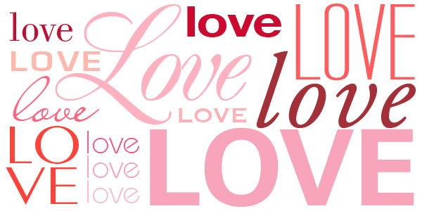
14 Feb For the Love of Great Type
One of the most important aspects of any piece of design hinges on its use of typography. The proper choice of font, its placement on the page, color spacing, etc., all combine to set the tone of a piece. Whether you choose a serif or sans-serif, modern or traditional style, roman or italic type treatment, a few principles should be followed to ensure great typographical design.
1. Font Overload.
There are hundreds of thousands of beautiful typefaces out there… however, using them all could cause continuity issues, as well as a seizure! Limit your use of too many fonts. A general rule of thumb would be to use 2 different fonts… at the very most, 3. Varying the weights, sizes and styles of a chosen font family for headers, subheaders and body text will usually be all you need to keep a cohesive, professional look in a design.
2. Size Matters.
Yes, size DOES truly matter in creating great typography in your design. It helps to distinguish and group different sections of thought throughout the piece… establishing a flow for reading and legibility. Body copy should be all one size… and determining that size should depend on the media it will be viewed (print or online?) and who the viewer will be (20-somethings or baby-boomers?). Use headers and subheaders in a larger size than the body to further organize the content to make the piece more appealing.
When it comes to websites, a good rule of thumb is to make sure that your font sizes are over 16 pixels for body copy for optimal reading ability. Of course, every font is different when it comes to design and size, so testing the font will be a must for use online.
3. Space – The Final Frontier?
There 4 types of spatial properties that need to be correctly addressed when working with typography:
- Leading, the space between the baselines of successive lines of text;
- Tracking, the space between groups of letters;
- Kerning, the space between each character in a font; and
- Alignment, how the text aligns on a page.
Leading can affect the readability of long lines of text. The tighter (closer) the leading, the harder the text may be to read. The looser the leading, and the more white space there is can reduce the pace of reading. It is recommended that leading be set at 120% of the font size. For example, if you have 10pt text, your leading should be set at 12pt.
Tracking can be described as loose, tight, or set by a numerical value. It is a more global setting that affects how close all the characters are. Generally, the longer the line, the looser the tracking needs to be, depending on the font.
Kerning is the local view of space between characters. The shape and the amount of space between each character will determine the need for kerning. Proper kerning will allow the eye to flow easily when reading a piece.
Alignment refers to flush left, flush right, centered, or justified text. Flush left is how western societies normally read… from left to right… with the text aligned to the left and ragged right. Flush right is more cumbersome to read and is traditionally used to highlight important sections of text. Centering text works best with limited lines as it can be difficult to read. Justified text means that both the start and end lines of text reach both the left and right edges. This can create awkward spaces (valleys) throughout a block of text. However, when done correctly, it can create a very clean and legible effect.
4. Readability/Legibility… What’s the Difference?
Readability refers to how easy it is to read words, sentences, and blocks of text. Legibility is the capability of distinguishing one letter from the next in a font and distinguishing small chunks of text (headers).
Our eyes read in phrases, and the shapes of words determine the speed at which we read and comprehend. For long blocks of text (body copy), sans-serif or old style serif fonts set in lowercase provide the best standards for readability. All caps are suitable for headlines and short sentences. Using fonts with extra large or small x-heights makes the text less legible.
5. Color Me a Rainbow… or Not!
Color and typography interact dynamically and help to set the tone for a design piece. Choosing certain colors can help attract attention, organize content, and help with readability. Black on white is the easiest to read, however; using other colors with high contrast can work as well. The same colors create different effects when placed on light and dark backgrounds, so it’s a good thing to experiment to find which works best.


Sorry, the comment form is closed at this time.